MARYAM MARALANI / CASE STUDY 01
HAGLÖFS
Reimagining
premium outdoor
e-commerce.
PROJECT FACTS
- Client-based school project
- 7 weeks
- Role: UI/UX Designer & Client Representative
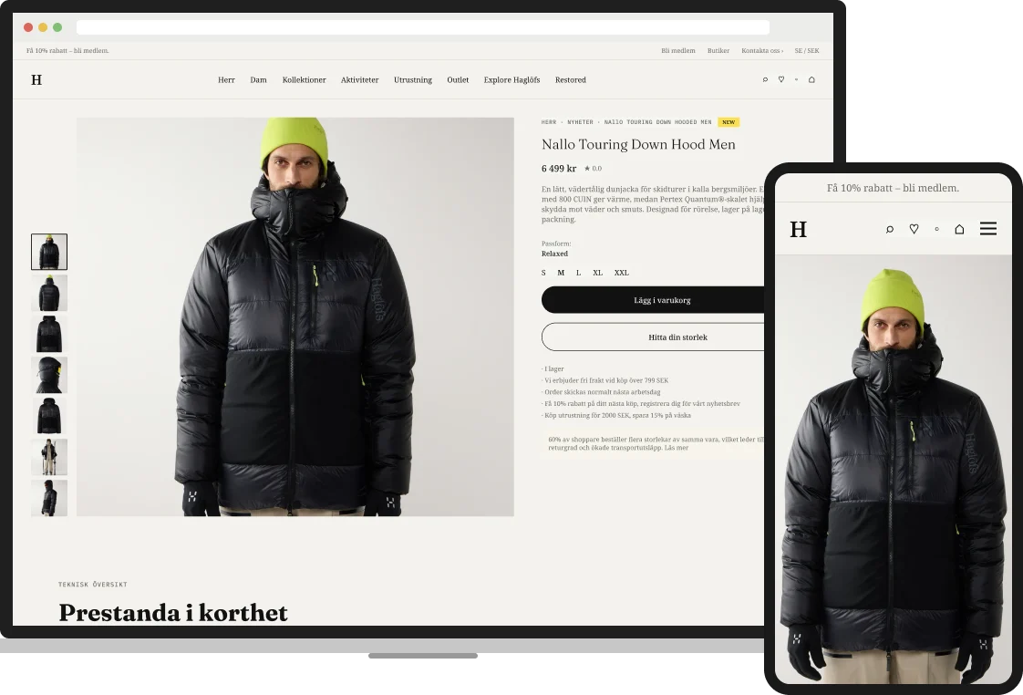
A client project exploring how Haglöfs could make its product page feel more premium — while preserving clarity, product truth and responsible use of AI.
COMPETITOR RESEARCH · REGULATION RESEARCH · PDP DESIGN · USER TESTING
THE PROBLEM
Haglöfs sells at a premium price, but its product page felt generic — accurate, but not distinctive.
WHAT I DID
Researched competitors and EU AI rules, designed two product-page directions, and moderated eight user tests.
THE RESULT
A tested, progressive-disclosure product page for desktop and mobile — with AI imagery labelled by design.
01OVERVIEW
The challenge
Haglöfs asked how AI could make its product pages feel premium and produce content at scale. We reframed the brief around what they already had — their existing product photography, with no reshoots. That split the work into two questions.
TWO QUESTIONS, ONE TEAM
QUESTION 1 · THE TEAM
What AI — and what should it generate?
Which AI approach could make existing photos feel premium — consistently and affordably? My teammates researched and tested it.
QUESTION 2 · MY FOCUS
Where should AI imagery live on the page?
Where on the product page should AI imagery appear, and how should it be shown so it never misleads? This was my part.
02MY CONTRIBUTION
Where I made the difference
01
UI/UX design
Two product-page directions for desktop and mobile — including the icon summary and material close-ups.
02
User testing
Moderated eight sessions. The findings chose the final design.
03
Responsible AI
Turned EU and Swedish rules into a visible AI label.
04
Client liaison
Adapted to the client and narrowed the scope to the product page.
03FROM RESEARCH TO DESIGN
The research had one job:
make the design decisions easier to defend.
Premium brands don’t add more content. They use clearer hierarchy, context and progressive disclosure to make value easy to see.
WHAT MAKES PREMIUM, PREMIUM?
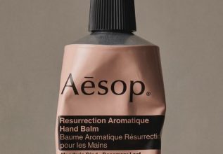
Aesop
Simplicity and minimalism
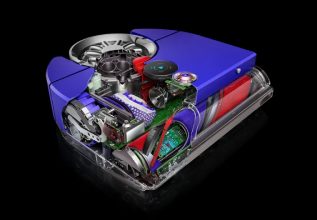
Dyson
Engineering made easy to understand
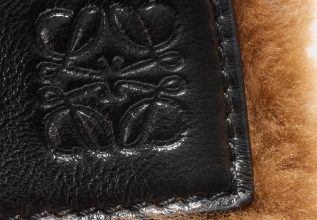
Loewe
Craft shown — the handmade made visible
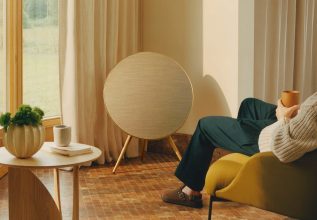
Bang & Olufsen
Materials before features
↓ Four kinds of premium product content
01
Product photos
Clean, simple e-commerce imagery.
02
Product video
Movement and cutaways that explain the product.
03
Fabric close-ups
Materials and details you can almost touch.
04
Real environments
The product where it belongs — outdoors.
From product documentation → to product demonstration.
04QUESTION 1 · THE TEAM
Question 1: a custom-trained model,
not an off-the-shelf tool.
My teammates’ work — included because it shaped where imagery could go. They compared four ways Haglöfs could use AI:
WHAT A LORA IS
A small trained layer on top of an existing image model that teaches it one consistent Haglöfs look.
WHAT TESTING SHOWED
A few consistent training images beat many inconsistent ones.
THE RECOMMENDATION
A 2–6 week pilot (15–50K SEK) on products that are already released.
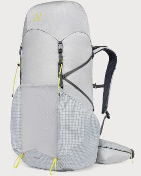
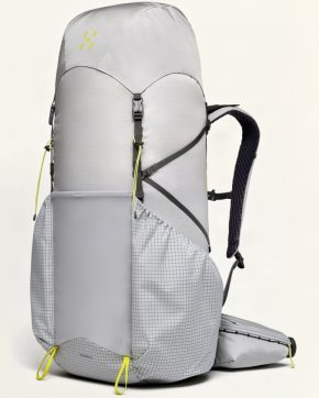
TRAINING RESULTS
TEST 1 · 12 MIXED TRAINING PAIRS
TEST 2 · 3 CONSISTENT TRAINING PAIRS
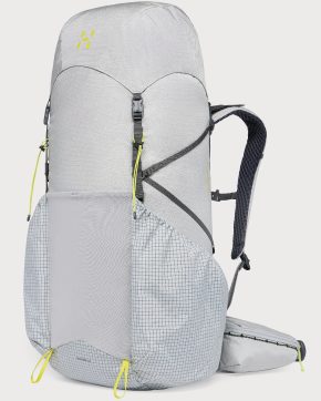
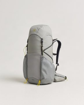
Even the trained model smoothed textures and subtly changed proportions. For my part, that made two things essential: deciding where AI imagery belongs, and labelling it clearly.
05QUESTION 2 · MY FOCUS
Question 2: where should AI imagery
go on the page?
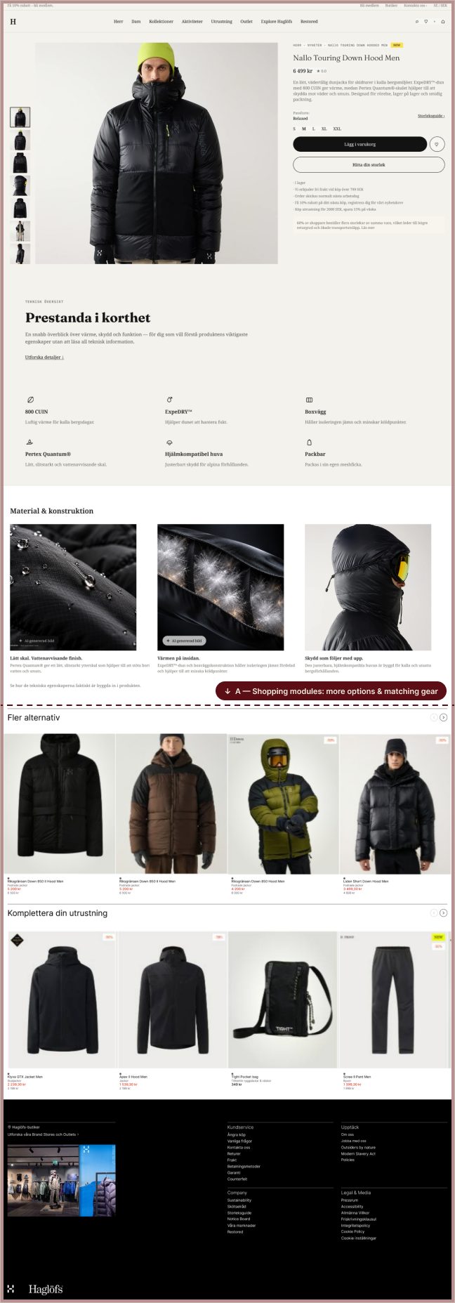
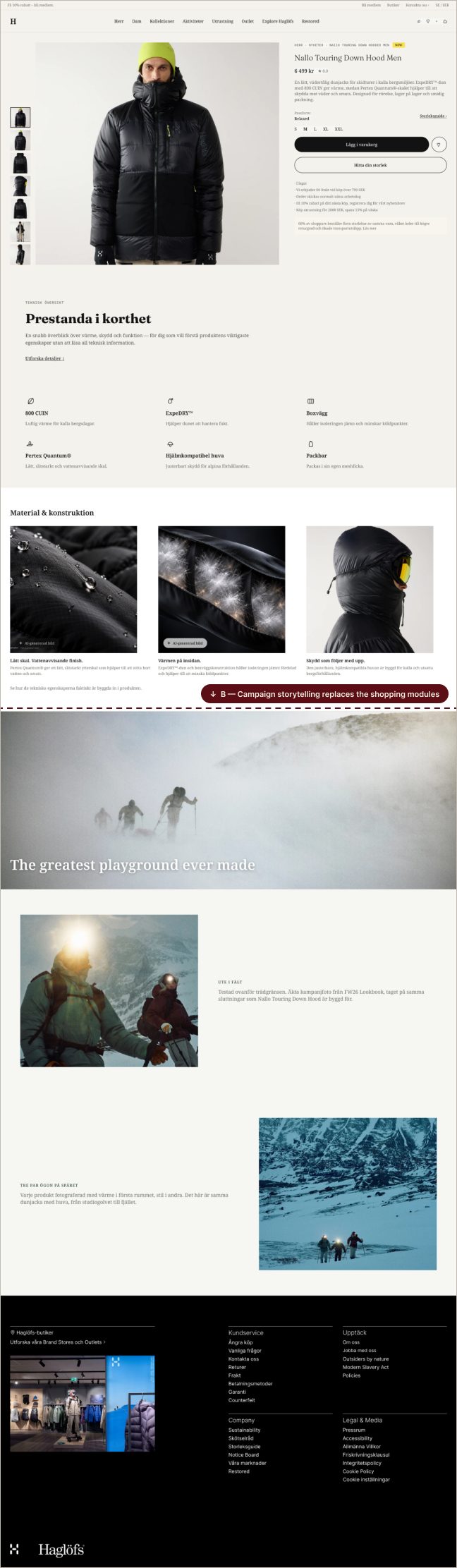
This was my part. I studied how outdoor brands use imagery on their product pages, then designed two directions to test.
TWO INSPIRATIONS, TWO DIRECTIONS
Two brands from my UI/UX review became the two directions:
ARC’TERYX · BETA AR JACKET
Technology explained visually
→ Direction A — Progressive disclosure
NORRØNA · LOFOTEN GORE-TEX PRO
Campaign photography on the product page
→ Direction B — Campaign storytelling
06USER TESTING
Two directions, eight sessions,
one clear winner.
I moderated eight sessions comparing the two directions, with a teammate taking notes. Participants were mostly schoolmates, so the results are directional.
01
Findings
Most preferred A for scannability and faster access to specs. Most weren’t put off by AI imagery; a minority raised sustainability concerns, not quality ones.
02
Decision
Direction A became the final design. The findings decided it — not our own opinions.
Quotes from user testing
“I prefer material and specs shown as icons.”
“Bigger images and clearer visual presentation aid understanding.”
RESULT · DIRECTION A CHOSEN
07FINAL DESIGN
Turning technical product value
into something users can see.
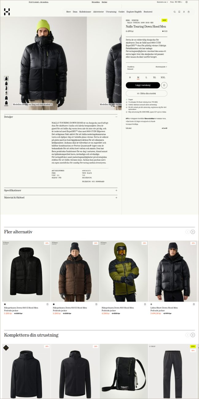
Purchase essentials first; then an icon summary, material close-ups and full specs on demand. The scope narrowed to the product page at Haglöfs’ request.
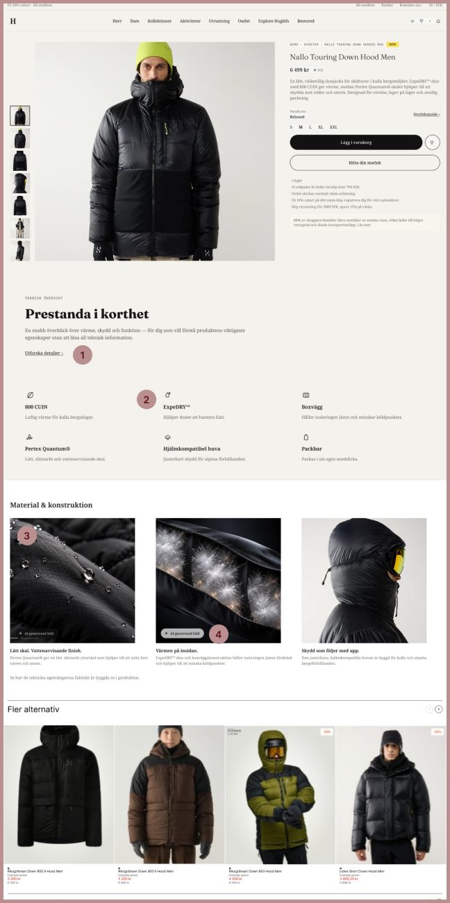
WHAT I CHANGED — AND WHY
Details on demand
Replaced the long “Detaljer” text with a short summary and an “Utforska detaljer” link to the full specs.
Specs as icons
Added “Prestanda i korthet”: six key specs as icons. Testers found icons faster to scan than paragraphs.
Material close-ups
Added macro close-ups that make the water-repellent shell and down construction visible — inspired by how Dyson explains its tech.
Labelled AI imagery
Added a label on each AI-generated close-up, visible at first exposure and readable without relying on colour.
08RESPONSIBLE AI
Transparency became a
design requirement, not a footnote.
I read the original EU and Swedish legal texts myself. Three rules shaped the interface:
01 · EU AI ACT, ARTICLE 50
Realistic AI-generated content must be clearly labelled at first exposure.
DESIGN RESPONSE
The label sits on the image itself — not in a caption or a footnote.
02 · WCAG ACCESSIBILITY
A label can’t rely on colour alone, and needs proper contrast and alt text.
DESIGN RESPONSE
A high-contrast text label that reads without any colour cue.
03 · SWEDISH MARKETING ACT
Marketing can’t imply qualities a product doesn’t have — AI or not.
DESIGN RESPONSE
AI may add context, but never changes the product’s colour, fit or construction.
The label is a design response to these principles — not a legal claim about exact wording.
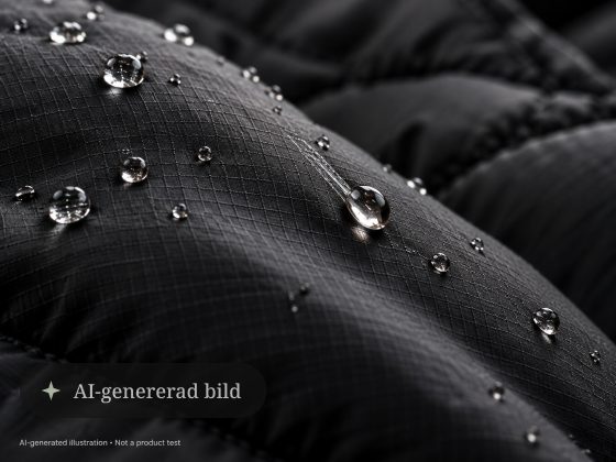
DESIGN PRINCIPLE
Product truth stays fixed.
The “AI-genererad bild” label as designed on the product page.
09COLLABORATION
Design was only part of the job.
I was the team’s link to Haglöfs. The client preferred texting over email, so that’s how we worked — and we reshaped the scope around their real priorities.
01
CLIENT INPUT
Requests and feedback from Haglöfs.
02
CLARIFY
Turn open asks into clear, answerable questions.
03
ALIGN TEAM
Share what was decided, and why.
04
DESIGN DECISION
Translate it into the interface.
05
FEEDBACK LOOP
Bring the result back to the client.
10OUTCOME
The project ended in a tested
PDP direction — chosen by
evidence, not opinion.
Familiar shopping patterns, a clearer hierarchy, visible material proof and transparent AI imagery — tested with eight users and designed for desktop and mobile.
What I learnedLaw can be a design constraint: the AI label is the regulation made visible. Next time, I’d test with people closer to Haglöfs’ real customers.