MARYAM MARALANI / CASE STUDY 02
MARIA UNGDOM
Treatment support,
one small step
at a time.
PROJECT FACTS
- Client-based school project
- 6 weeks
- Team of 4
- Role: UX Designer
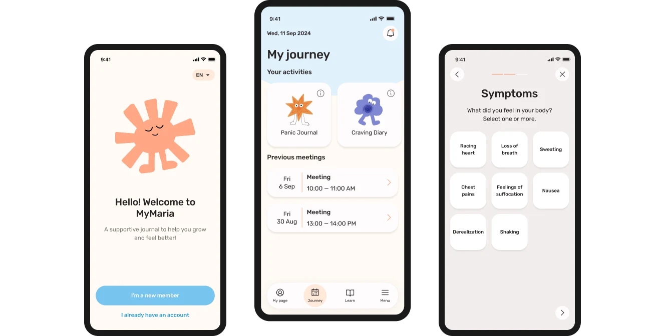
A six-week client project with Maria Ungdom, a care provider supporting young people struggling with addiction. Informed by research into neurodivergent needs, we used TEACCH principles to make treatment activities clearer and easier to complete.
EXPERT INTERVIEWS · JOURNEY MAPPING · IDEATION · USABILITY TESTING
THE PROBLEM
Young people in Maria Ungdom’s care often didn’t finish their treatment plans — material got lost, reminders were missing and tasks felt too hard.
WHAT I DID
Ran expert interviews, mapped the user journey and ran user tests that showed the onboarding needed to be longer — then fed the findings back into the team’s designs.
THE RESULT
A calm, accessible app that breaks treatment into bite-sized steps, with customizable reminders and a longer onboarding shaped by testing.
01OVERVIEW
The challenge
Maria Ungdom wanted to improve engagement with treatment plans. Young people could lose or forget materials, miss reminders, find assignments difficult to begin, or experience the work as emotionally demanding.
How might we make treatment plans more accessible and engaging, so young people can take a more active role in their treatment?
THE CONCEPT
A focused mobile app that helps young people follow their treatment plan, one small step at a time.
CORE PRODUCT IDEAS
- Today-focused home
- Manageable task steps
- Adjustable reminders
- Treatment journey + learning
- Privacy by default
02MY CONTRIBUTION
My role: UX Designer
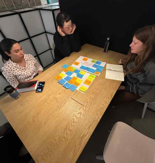
Expert interviews
Planned and conducted interviews with professionals working with young people and substance use.
Desk research
Reviewed existing research and comparable support products to frame accessibility and engagement needs.
Journey mapping
Created the research-informed user journey to surface trust, privacy, reminders and low-energy friction.
Validation
Ran peer usability tests and translated the findings into changes to onboarding.
Research synthesis & final presentation
I structured and designed the final presentation for both the client and the class, turning the team’s research, decisions and product concept into a clear narrative for stakeholders.
03RESEARCH & DESIGN DIRECTION
Research that shaped
our design direction.
In the desk research and expert interviews we realized that there is meaningful co-occurrence between addiction and neurodivergency.
DESK RESEARCH · CO-OCCURRENCE
Co-occurrence between addiction and psychiatric or neurodevelopmental disorders.
≈34% ADHD
34.2% of boys · 34.0% of girls
8.0–8.8% Autism
8.0% of boys · 8.8% of girls
Ages 10–17 in the studied care population: substance-related care in 2017, with psychiatric diagnoses recorded during 2016–2018. Socialstyrelsen, 2019, p. 39. These figures describe co-occurrence; they do not establish causation.
Design implication: make it easier to plan, understand the next step and begin treatment activities.
INCLUSIVE DESIGN
Solve for one, extend to many.
We designed around neurodivergent needs for structure and guidance, with the intention of also supporting people who feel stressed, distracted or unfamiliar with treatment.
Microsoft Inclusive Design · Potential wider benefits remain to be tested with intended users.
“For challenging tasks, break them down into smaller, more manageable steps.”
“Help the individual see that the reward lies in breaking free from harmful behaviors, rather than relying on external factors.”
“Many of the young people dealing with addiction also experience neurodivergencies.”
From external rewards
to meaningful support.
We initially explored Duolingo-inspired gamification. Expert interviews prompted us to prioritise the personal value of treatment activities over external rewards. Structure and visual guidance became our way to help users begin.
04JOURNEY MAPPING
Finding friction across
the full treatment journey.
I created a journey map covering recommendation, download, onboarding, reuse and retention. Because we did not have direct access to target users, the persona was treated as a research-informed proto-persona rather than a validated user persona.
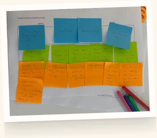
Journey highlights
HOW ALEX FEELS AT EACH STAGE
-
Resistant
01
Recommendation
DOING
Hears about the app from his therapist and asks questions about it.
FEELING
“Why should I download an app on my phone? Will I be tracked?”
PAIN POINT
Doesn’t trust the app and hesitates to download it.
OPPORTUNITY
Say clearly that data stays confidential and nothing is tracked outside the app.
-
Uncertain
02
Download
DOING
Finds the link on Maria Ungdom’s website and downloads it from the app store.
FEELING
“I hope this app works for me.”
GOAL
Download without complications and feel like a step forward in treatment.
OPPORTUNITY
Keep the path from link to first screen short, calm and safe-feeling.
-
Doubt → hope
03
Onboarding
DOING
Signs in with BankID, follows setup and sets reminders for tasks and meetings.
FEELING
“Is it going to work? I hope it makes treatment easier.”
PAIN POINT
Doesn’t understand how the app works, or when reminders suit him.
OPPORTUNITY
Short, clear explanations and fully customisable notifications.
-
Mostly positive
04
Reuse
DOING
Does daily tasks, tracks progress and reschedules meetings in the app.
FEELING
“This is cute and helpful, but I hate doing tasks every day.”
PAIN POINT
Long shifts leave little energy to engage with treatment.
OPPORTUNITY
Ask users and therapists for feedback to keep refining the experience.
-
Accomplished
05
Loyalty & Retention
DOING
Keeps journaling after tasks end and fine-tunes smart reminders.
FEELING
“I feel a sense of accomplishment.”
GOAL
Feel more involved in, and in control of, his treatment.
OPPORTUNITY
Smart reminders that adapt as his routine settles.
05DESIGN APPLICATION
FROM RESEARCH TO INTERFACE
The TEACCH method: seven questions.
What should I do?
Where should I be?
Who should I be with?
How long will it last?
What will happen next?
What do I need to have?
Why should I do this?

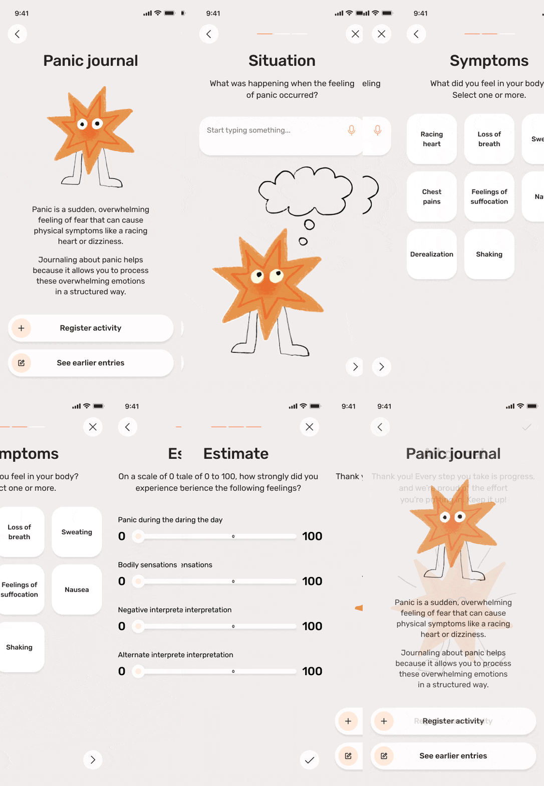
TEACCH PRINCIPLES IN PRACTICE
One activity.
Clear, manageable steps.
The current assignment gives users a clear starting point. Panic Journal then separates the activity into situation, symptoms and intensity, with one focus at each stage.
Visual cues connect the activity across screens, while the final message acknowledges the user’s effort. These choices were intended to make the process easier to follow.
PANIC JOURNAL WALKTHROUGH
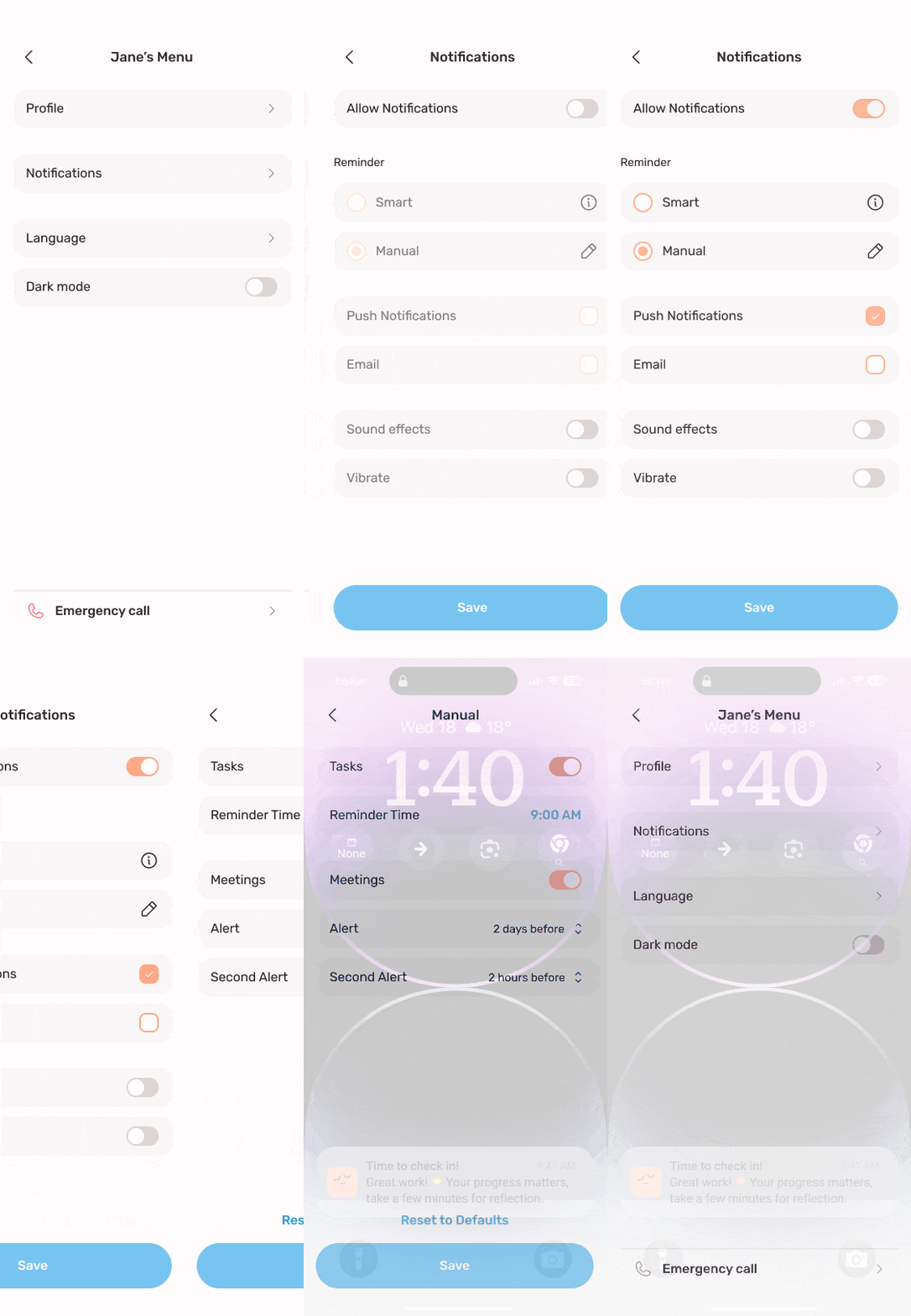
REMINDERS IN PRACTICE
Reminders that
fit each user.
Missing or forgotten reminders were one of the main reasons young people fell behind on their treatment. In MyMaria, users choose between smart and manual reminders and decide what they are reminded about.
Task reminders and meeting alerts can be set up together with the therapist, so reminders support the treatment plan instead of adding pressure.
NOTIFICATION SETTINGS WALKTHROUGH
06TESTING & ITERATION
Testing challenged our assumption:
shorter is not always simpler.
In peer usability testing, approximately seven classmates tested the prototype. Their feedback showed that the introduction needed more guidance and reassurance.
BEFORE · PEER FEEDBACK
The onboarding felt too brief. Users needed more explanation before entering the app.
AFTER · DESIGN REVISION
We added introductory steps and friendly graphics to explain the app and provide more support.
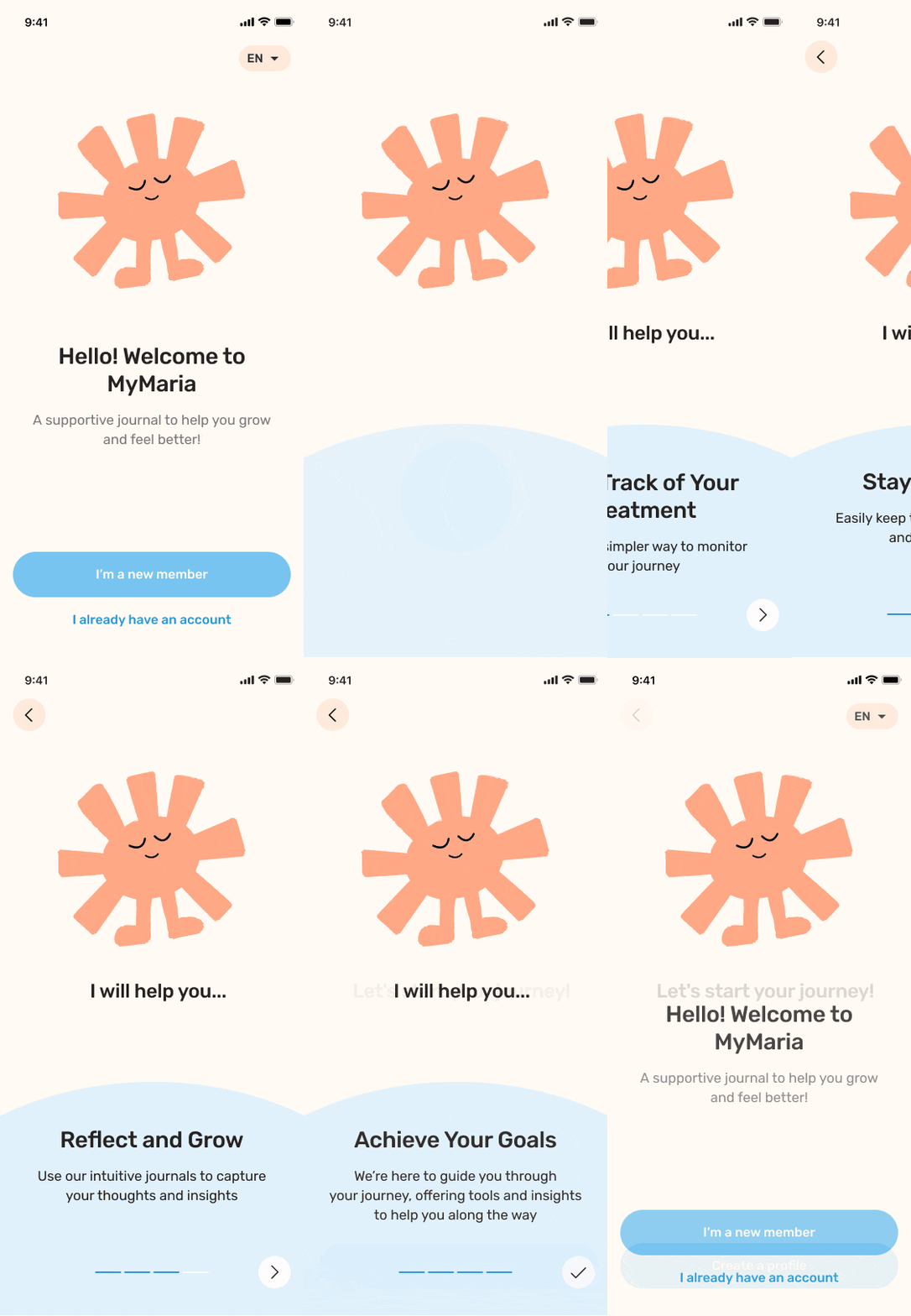
THE REVISED ONBOARDING
Four short intro screens now explain what the app does — keeping track of treatment, staying organised, reflecting and setting goals — before asking users to create a profile.
Takeaway: assess how well a flow supports understanding, not only how few steps it contains. Next, test the revised onboarding with intended users to assess clarity, effort and reassurance.
07OUTCOME & REFLECTION
The simplest answer
turned out to be
the strongest one.
Other teams pitched ambitious concepts like gamification and AI assistants. Our calm, research-based app was rated the strongest solution by Maria Ungdom and our teachers — because it fit how their young people actually live.
What I learnedResearch beats novelty: let evidence decide, even when the answer is simple. And inclusive design is good design — structure and small steps built for neurodivergent users made the app easier for everyone.